-
-
@stop Here’s a little tour and a bit of history around the eccentricities of that design for anyone who wasn’t around then. Or for anyone who just wants to nod in a “yep, remember that” kind of way.
-
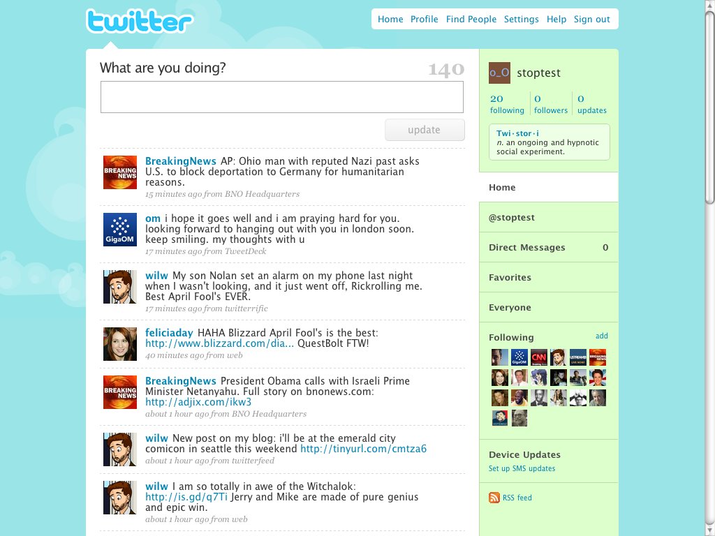
@stop First and most obvious to *me*, is the “What are you doing?” prompt. Twitter was still mostly a way to update your status, but was starting to convert to more of a pulse on what was happening throughout the world. We changed the prompt to “What’s happening?” about 4 months later.
-
@stop The status update field included the 140-character countdown to keep you aware of how much space you had left. Max length of 140, because status updates were originally delivered through SMS, which had a limit of 160 characters, minus room for the 15-char username plus spaces.
-
@stop Also, the button was labeled “update”, because it *updated* your status, and the timeline was a bunch of status updates. Biz started calling them “tweets” on Twitter’s blog in 2008. But it wasn’t until about 18 months later when we started calling them Tweets in the UI.
-
@stop The logo back then was just text, no bird. We didn’t start using a bird as (or in) a logo until we launched #newtwitter in 2010, which placed a bird next to the wordmark as a transition. We knew we eventually wanted a solo Twitter bird to be as iconic as the swoosh and the apple.
-
@stop Note the three stats across the top right (following, followers, updates). One of my first tasks as CD was to figure out how to fit 7-digit numbers plus 2 commas into that column as @aplusk and @cnnbrk raced each other to a million followers. cnet.com/tech/services-…
-
@stop Right below those stats were little definitions to introduce new users to tech and terminology on the platform, both from internal features, and from developers doing cool stuff with the API.
-
@stop At the top, “Find People” had prominent position as the only search you could do on twitter.com at the time. Twitter had just acquired Summize, and hadn’t yet completely integrated status search (they weren’t called Tweets yet!) into Twitter core yet.
-
@stop Updates you liked were called “favorites” and used a star icon. Some used them as signals to the original author, some used them as bookmarks to come back to later. “Favorite” was eventually deemed too strong, and we changed to “likes” and the heart to conform to other services.
-
@stop Further down in the right column, was the “Everyone” timeline, where you could go to see every single status update from every single user (if you refreshed fast enough). Even in 2009, you rarely could track a single update between refreshes, because volume already was so high.
-
@stop Profile avatars were still square. Without even any rounded corners yet. And we showed quite a few of them on your Home timeline, and on the profile page. So you could just click from profile to profile discovering new users without opening up follower/following lists.
-
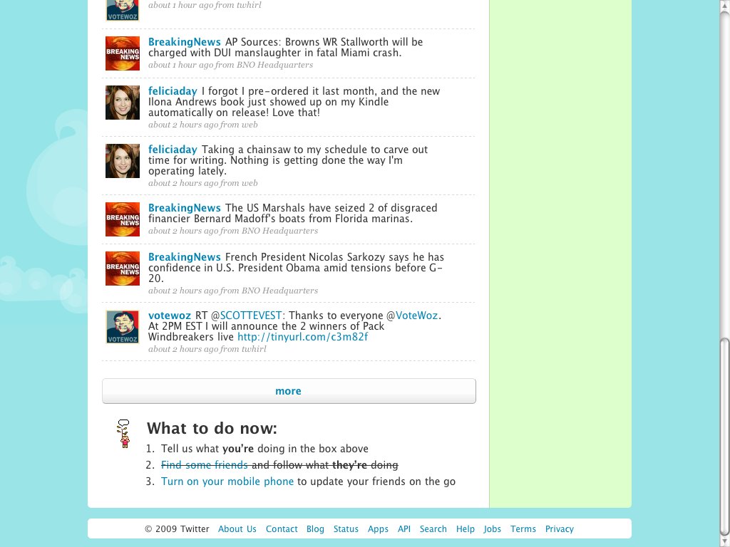
@stop Timestamps below updates were relative up to a certain n days ago, if I remember right. And after every timestamp was the source app used to push the update, which was a cool way back then to discover other 3rd party apps people were using for Twitter.
-
@stop Twitter actually supported an RSS feed of updates, and linked to it back then. Imagine the speed at which that would’ve updated, possibly crashing some RSS readers of the day.
-
@stop In the feed, conversations/threads did not yet exist. Nor did any icons to take actions on each update. You had to click the timestamp to get to the “permalink” (the permanent URL) of each update.
-
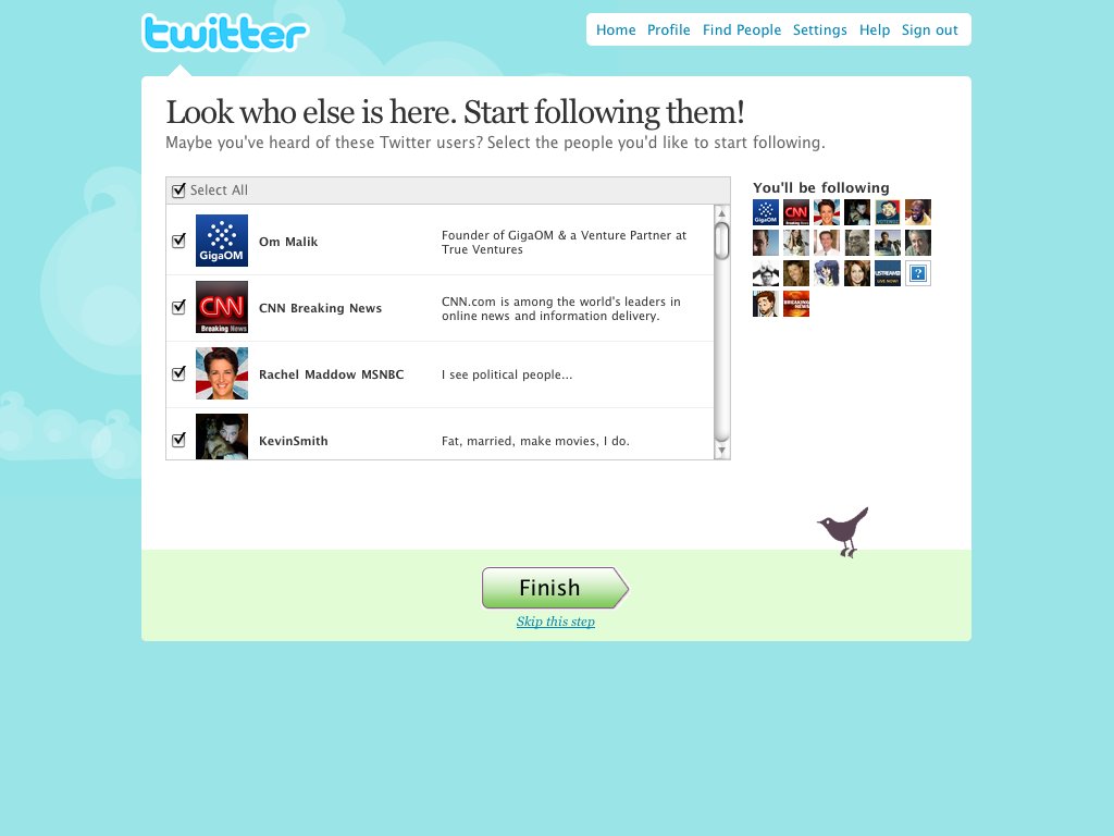
@stop The accounts here were all from the SUL, or Suggested User List, which helped jumpstart new user accounts back then. The SUL became controversial, as many users wondered how it was composed. It was viewed as king-maker because users on it rapidly gained lots of followers.

-
@stop The SUL was dramatically overhauled and split into multiple categories during the launch of #newtwitter in 2010, and further refined based on algorithmic interests a year later. I have no idea if it still exists in some type of form today for new account signups.
-
@stop The bottom of the logged-in Home feed featured a “more” button to load in more updates, and a short list of tasks that Twitter suggested for new users to complete. Infinite scroll didn’t show up until #newtwitter in 2010.

-
@stop Also, 140?!? How the hell did we (users) manage that for so long? I had trouble fitting some of these concise memories into 280 characters.
-
@stop Which is one reason why short usernames were so prized back then. You could literally fit an extra word or two into a reply to a short username.

