Replies excluded. Include replies
-
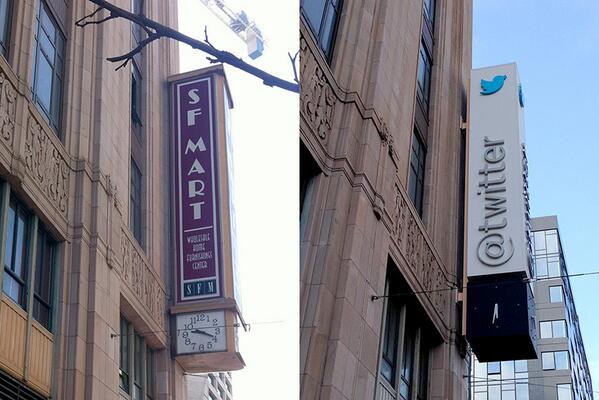
@rgladwell The old sign was a mockery of deco style.
-
@Draug419 Actually, the old sign was a tacky add on during the 70s that attempted to look Deco, but failed miserably.
-
“It becomes […] apparent, when we try to understand […] humans through research, that we are not rational creatures.” wired.com/opinion/2013/0…
-
@pullober Oh, I was joking. The clock isn’t working yet, because we haven’t hooked up electricity.
-
@pullober Yes – we’re keeping it consistent with its predecessor. ;-)
-
@PaulAnnett Yes, there is. But we had to adjust the size of the bird down a bit to ensure that.
-
@nquo You’ll have to wait for the nighttime photos to find out…
-
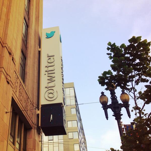
The new @twitter HQ sign is an homage to the civic importance of its predecessor. Here’s old vs new.
-
@smcbride Yes – proud of this one. There’s more to it too.
-
@seacue I like that we kept the consistency of the broken clock. ;-)
-
@seacue Design still has time to iterate, right?
-
@smcbride Entirely new structure and design.
-
Identity, location, and address, all at once. A sign of what’s happening, @twitter.
-
@ehdv @miradu If it were just a mention of the account, I agree. But a reply comes with certain expectations.
-
@khoi The flat version existed on signage and marketing materials long ago. We proposed several times that the product adopt it.
-
@IKoudounas @mhauer Nope. And it wasn’t new back then either. We just liked this version better, and wanted the UI to adopt it.
-
@buster @kris @brianellin @miradu @sippey Speaking of that, we could use more pillows at the office…
-
@brianellin @miradu @sippey True. Thus why I said Twitter should warn, or possibly prevent the reply.
-
@miradu No. But Twitter should probably warn on attempt. Or possibly prevent the reply in the first place. Similar to DMing a non-follower.
-
@anildash I just never understood why all the signage all over campus sported this logo, but the products never adopted it.
-
@jaycrimes It already existed in that form on most of the signage throughout campus. We didn’t invent it, just thought it should be adopted.
-
About time, Google. We proposed this exact logo more than six years ago. fastcodesign.com/3017047/google…
-
@gwb @kalkor @FireflySF @jqln Has been a great experience every time we’ve been. Small place, warm, friendly atmosphere.
-
@onethinline @FireflySF A couple years ago, yes. Hasn’t been on the menu for us since. We used to live around the corner from them.
-
Easily one of the best restaurants in SF: @FireflySF. Always so good, comfortable, friendly, and a perfectly focused menu.
-
@neilyourself Not sure. There may still be some kinks that aren’t displaying correctly. If you see something similar again, let me know.
-
@neilyourself Right. So a tweet from Frank should either be present in the blueline group, or implied by “n more replies” in between.
-
@neilyourself @dougdanger Hmm. That shouldn’t be possible, at least not by design. Where is the reply tweet that you replied to?
-
@dougdanger @neilyourself Except that Neil’s tweet is not in reply to Emmy’s, so the line should never directly connect those two tweets.
-
@iA Well stated. I don’t really care about the end result. But I am quite disgusted by the flippant attitude and naïveté in brand identity.
-
@richedwards140 Not me, at least not yet. I’d like to see Apple figure this out. @hemeon @wilsonminer @mikeindustries
-
@hemeon @wilsonminer Apparently a month or more of iOS7 usage is pushing @mikeindustries over to Android.
-
@wilsonminer Oh, Math.
-
@wilsonminer Good to know. But man, this is the first time I’ve adopted something new and felt this much frustration.
-
@couch Oh, I know. That’s why I asked others if the frustration fades over time: twitter.com/stop/status/37…
-
@shaneadams Have experience with it already? Or just taking my word for it?
-
Sorry. The combination of the Yahoo logo hype and day 2 of using iOS7 has me unusually grumpy today.
-
@sgrant22 @alexhorre Hard to explain, and most of what I would screenshot, I can’t show because of the content.
-
@stop Also, notification density on the lock screen. iOS6 used to fit at least 3-4 on one screen. On iOS7, only two notification items fit. <sigh>
-
@alexhorre Hmm. I can try that, but I actually bumped it down last night. Some of the text seems horsey and clunky.
-
@alexhorre Yep, 5. Tap targets seem too small and close together. Borderless buttons don’t imply a large enough target.