Replies excluded. Include replies
-
@Malarkey Negative, sir. That’s Columbus Tower in North Beach: en.m.wikipedia.org/wiki/Columbus_… I was in the Hobart on Market: en.m.wikipedia.org/wiki/Hobart_Bu…
-
Maybe I’m in the minority. I’ve actually been enjoying using Docs and Sheets on iOS. w.readwrite.com/1sqTBLB
-
@jlax A little concerned about the pluralization of talents.
-
My fortune cookie from this week: “The world will soon be ready for your talents.”
-
@alexhorre @KuraFire Ideally, the profile stats would invert to white and roll up on top of the photo, eliminating one row. But, you know…
-
@KuraFire I heard you like menu bars…
-
@aaronadams_ Unsure what the @ sign accomplishes here?
-
@jmspool My biggest area of frustration in Calendar remains the search experience. Ironic, given core competence and all.
-
@jmspool That they work at all? Or the mechanics of how? Might be because I designed the first version, but I’ve always grokked the UI.
-
@charliecapen Happy birthday, Charlie! Thanks for sharing your fatherhood journey with us.
-
@rothmana This has been fascinating to watch.
-
@mathowie Same here. I actually stopped traveling with it (v1) because it was too much hassle going through security. cc @twelvesouth
-
@borjacg Ah! Ok, your tweet just arrived out of context.
-
@behoff Once a year? Let’s think about what would/could happen if it were once a week…
-
@borjacg Thanks, man! (Uh, good job on what?)
-
@LanetteCornford Welcome! About time you’re here… Also, make sure @JennaCornford includes the w next time. ;)
-
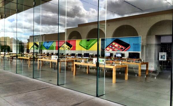
Apple Store / Stanford
-
@socacouponmommy Cheers! Maybe this Twitter thing will catch on after all. ;-)
-
@gavinwassung I think the overlap needs something other than being darkened. The knockout of previous makes the P much more identifiable.
-
@tjack I think that’s mostly due to an optical illusion. But you’re right. A lot of the angles appear to be off, even in the logotype.
-
@Ed @AccessIconPro @brianglenney I’ve seen the new symbol, and I like what it represents and connotes.
-
@sampullara @edwk Yeah, thinking the darkened overlap goes the wrong direction. Had they lightened each other, might be a better read.
-
@edwk Not sure. It’s easy to be a back-seat driver here. The P seems much more identifiable in the 2007 version.
-
@luxuryluke Apparently we’re about to see a big ad/marketing blitz.
-
I like the concept behind the new PayPal logo, but the execution doesn’t feel finished.

-
@joshelman That works too.
-
@joshelman I love how you and all the kids are talking about how awesome the snapchat update is… on Twitter.
-
@iamnirav Right? It gets a lot more personal when you change that headline to “Burying Earl”.
-
@kpk Better than “a Yuriy”.
-
@mwiik No – I think we sometimes shortened to dub-dub-dub.
-
I have always pronounced URL by calling out its letters, U-R-L. This piece makes me want to humanize it to “Earl”. http://t.co/MuyhDc4Cgb
-
@grillitype I don’t know… imagine playing with the ratios and containers to get different results.
-
@inbdesign Never. May I never need to open (or even install) powerpoint again.
-
@alyssakara22 No idea – but since the text is mostly identical, that’s how I’m guessing they are auto-tweets (from a service).
-
@Moore Far from it. But it’s useful to trim through my mentions on days like this though. I’d miss a ton if I stayed on that filter tho.
-
@arifkhan7 Some days are better than others.
-
Spending my morning blocking the users who auto-tweet a Pacman video using “@stop #motion”. How about you? twitter.com/search?f=realt…